Context
SharePoint Framework (SPFx) v1.13 introduced a brand new component type named Adaptive Card Extension (ACE) to build your own cards to extend Viva Connections Dashboard desktop and mobile experiences. In my previous article, I’ve made an overview of what are Viva Connections Dashboard and Feed web parts in the SharePoint Online context as the mobile experience for Microsoft Teams mobile app is also out now in public preview and GA will be available within the upcoming weeks. In this new article, it’s finally time to show you the Viva Connections extensibility model and you how to start building your first custom card using SharePoint Framework so let’s have a look at this deeper now!


Prerequisites
First, to develop your own custom cards for Viva Connections Dashboard, you need to install globally the latest version of the SharePoint generator (v1.13.0) which is now available in GA through npm:
npm install @microsoft/generator-sharepoint --globalAnd that’s it, you are now ready to generate your first ACE project!
Note: if you are new in SharePoint Framework development, please setup your environment before following this article.
Create your project
To generate your project, use the Yeoman SharePoint generator as below:
yo @microsoft/sharepoint
Then enter the following values when prompted from the generator:
- What is your solution name? ace-my-custom-card
- Only SharePoint Online (latest) is supported. For earlier versions of SharePoint (2016 and 2019) please use the 1.4.1 version of the generator. SharePoint Online only (latest)
- Where do you want to place the files? Create a subfolder with solution name
- Do you want to allow tenant admin the choice of deploying the solution to all sites immediately without running any feature deployment or adding apps in sites? Yes
- Will the components in the solution require permissions to access web APIs that are unique and not shared with other components in the tenant? No
- Which type of client-side component to create? Adaptive Card Extension
- Which template do you want to use? Primary Text Template
- What is your Adaptive Card Extension name? MyCustomCard
- What is your Adaptive Card Extension description? My custom card for Viva Connections Dashboard
When prompted, select Primary Text Template to create an ACE project based on this card template. You have three templates available at the moment that you can use:
- Basic Card Template
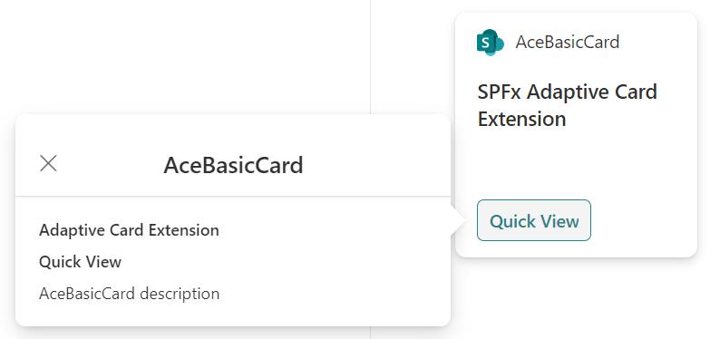
- Image Card Template
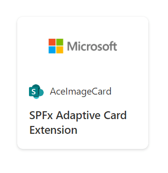

- Primary Text Template

At this point, you have to wait until the generator has finished creating your ACE project (a few minutes generally).
Overview of the project structure
Now let’s see what is the project’s structure of an ACE solution with SharePoint Framework. In this section, I’m focusing only on new generated folders and files as the other components are exactly the same as any other SharePoint Framework project (web part, extension, etc.).

- assets folder: this folder contains all the assets of your project, for example pictures and logos. By default, you’ll find a SharePointLogo.svg file inside it which represents the default card logo.
- cardView folder: this folder contains the card view files, this is the main component of a custom card extension and it’s mandatory to have at least one in your project. You can add multiple card view files to render the Medium and/or Large card sizes in your ACE.

- quickView folder: this folder contains the quick view files, by default you can find a template folder which contains a basic Adaptive Card template (JSON file) for your ACE. You can customize the template file for your needs or generate it directly in the code of the QuickView.ts file. You can also add more quick view files based on your needs.
- <solution-name>AdaptiveCardExtension.manifest file: the main changes in the manifest file are located in the supportedHosts and componentType sections which now support Viva Connections Dashboard as below:
"componentType": "AdaptiveCardExtension"
"supportedHosts": ["Dashboard", "SharePointWebPart"]- <solution-name>AdaptiveCardExtension.ts file: this file is the entry point of your ACE, it registers all the views (Medium view, Large view, Quick View, etc.), render the base card and load property pan settings. This is where you can also fetch your external data when the card is loading for example SharePoint API or Microsoft Graph.
- <solution-name>PropertyPane.ts file: this file contains the property pan settings, you can add your own settings to allow users to customize your custom card directly in this file.
Here is an example of a basic card view file with few comments to understand the methods:
export class CardView extends BasePrimaryTextCardView<IAcePrimaryTextAdaptiveCardExtensionProps, IAcePrimaryTextAdaptiveCardExtensionState> {

  /*
  Method to define the card buttons available on the card
  for example quick view, external link, etc.
  */
  public get cardButtons(): [ICardButton] | [ICardButton, ICardButton] | undefined {
    return [
      {
        title: strings.QuickViewButton,
        action: {
          type: 'QuickView',
          parameters: {
            view: QUICK_VIEW_REGISTRY_ID
          }
        }
      }
    ];
  }

  /*
  Method to define the card parameters based on the template
  for example: primary text, description, image, etc.
  */
  public get data(): IPrimaryTextCardParameters {
    return {
      primaryText: strings.PrimaryText,
      description: this.properties.description
    };
  }

  /*
  Method to define the action to execute on card click
  for example external link, quick view, etc.
  */
  public get onCardSelection(): IQuickViewCardAction | IExternalLinkCardAction | undefined {
    return {
      type: 'ExternalLink',
      parameters: {
        target: 'https://www.bing.com'
      }
    };
  }
Then here is an example of a quick view file with comments to understand the methods too:
/*
Interface to define quick view data
*/
export interface IQuickViewData {
  subTitle: string;
  title: string;
  description: string;
}

export class QuickView extends BaseAdaptiveCardView<
  IAcePrimaryTextAdaptiveCardExtensionProps,
  IAcePrimaryTextAdaptiveCardExtensionState,
  IQuickViewData
> {

  /*
  Method to bind quick view data
  */
  public get data(): IQuickViewData {
    return {
      subTitle: strings.SubTitle,
      title: strings.Title,
      description: this.properties.description
    };
  }

  /*
  Method to define the quick view template
  with external file or directly in the method code
  */
  public get template(): ISPFxAdaptiveCard {
    return require('./template/QuickViewTemplate.json');
  }
}
As you can see above, the template() method returns a JSON template which represents your quick view in the Adaptive Card format. In this context, you have two options available to generate your quick view:
- Create a JSON file in the template folder which contains your Adaptive Card code
- Write your JSON code representing your Adaptive Card directly in the template() method
In the default template file generated below (Basic Card Template), you can see the data binding to display the information at the right place in your Adaptive Card:
{
  "schema": "http://adaptivecards.io/schemas/adaptive-card.json",
  "type": "AdaptiveCard",
  "version": "1.2",
  "body": [
    {
      "type": "TextBlock",
      "weight": "Bolder",
      "text": "${title}"
    },
    {
      "type": "ColumnSet",
      "columns": [
        {
          "type": "Column",
          "items": [
            {
              "type": "TextBlock",
              "weight": "Bolder",
              "text": "${subTitle}",
              "wrap": true
            }
          ]
        }
      ]
    },
    {
      "type": "TextBlock",
      "text": "${description}",
      "wrap": true
    }
  ]
}
Test, build and deploy your project
Now you have built your first card, it’s time to test and debug your project in the SharePoint Online workbench, simply use this command:
gulp serve -l --nobrowser-l: skips tests andtslintto make the inner loop faster--nobrowser: skips trying to launch thelocalhosttest page


Note: since SharePoint Framework v1.13, the local workbench has been removed permanently. Online workbench is located at https://<sharepoint-site-url>/_layouts/15/workbench.aspx.
If you want to build and generate your SharePoint package file (.sppkg) from your solution, you need to use the same commands as other SharePoint Framework projects:
gulp build
gulp bundle --ship
gulp package-solution --ship
Then you just need to deploy the package (.sppkg) in your SharePoint app catalog and deploy it like any other SharePoint Framework solution, really easy no? 🙂
I hope this article will be useful to help you building your first custom cards for the Viva Connections Dashboard! If you have any question or request regarding this content, don’t hesitate to reach me out on my contact page you’re always welcome. I’m also doing a lot of sessions around Viva Connections extension points and extensibility model which include Adaptive Card Extensions (ACEs), SharePoint Framework and Dashboard so have a look at my upcoming events to register.
Finally, you can find a great new learning path about how to extend Microsoft Viva Connections with step-to-step examples and more.
Happy coding everyone!
Resources
https://docs.microsoft.com/en-us/sharepoint/dev/spfx/sharepoint-framework-overview
https://docs.microsoft.com/en-us/sharepoint/dev/spfx/release-1.13
https://docs.microsoft.com/en-us/learn/paths/m365-extend-viva-connections
 Yves Habersaat - Microsoft MVP (M365) & MCT